Visual Guide
Interactive Tutorial: DogsArk Kinship Tool v2.0
Welcome! This guide explains the features of the Kinship Analysis Tool, using screenshots as a visual reference. Clicking an image on the left will take you to the relevant section of the guide.
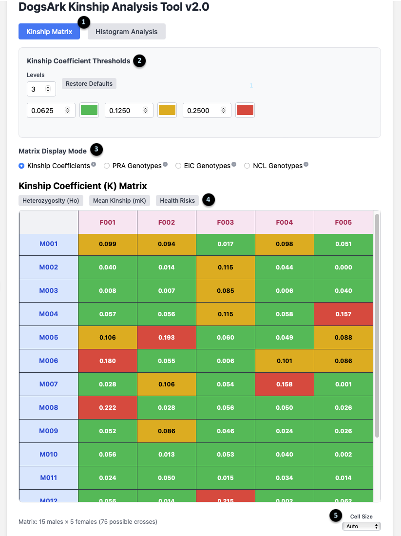
The Kinship Matrix View
1. Main View Toggle: These buttons switch between the `Kinship Matrix` and `Histogram Analysis` views. The matrix is for analyzing specific pairs, while the histogram is for a population overview.
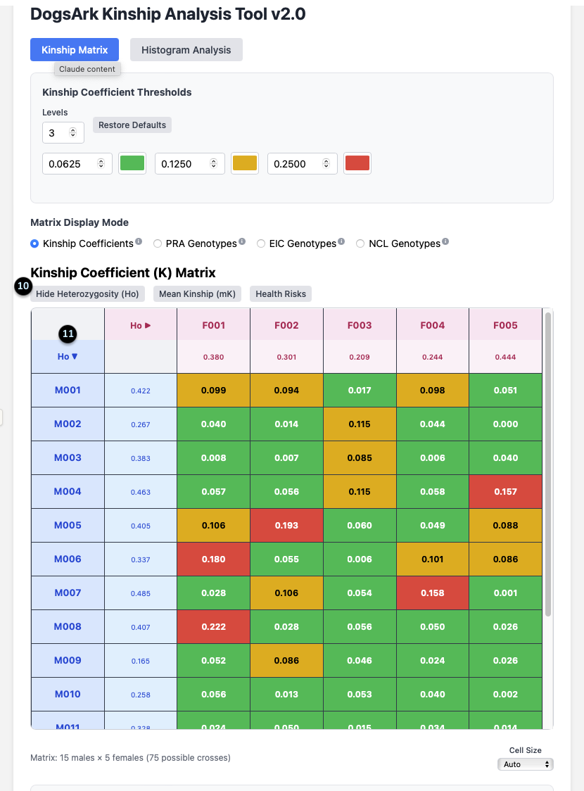
2. Kinship Coefficient Thresholds: This panel lets you customize the color-coding of the matrix. You can set the number of `Levels` and the `K` value at which the color changes, visually segmenting the kinship values into different ranges.
3. Matrix Display Mode: This allows you to change what data the main grid displays. The default is `Kinship Coefficients`, but you can switch to view outcomes for specific genetic tests. The tool can be configured to display any relevant genetic traits or mutations for a specific breed; `PRA`, `EIC`, and `NCL` are used here as examples.
4. Data Toggles: These buttons add more information to the matrix. They include `Heterozygosity (Ho)`, `Mean Kinship (mK)`, and `Health Risks`.
5. Cell Size: This dropdown adjusts the size of the cells in the matrix for better readability on your screen.
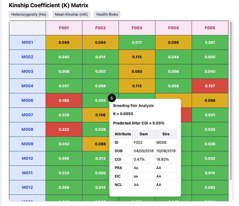
Breeding Pair Analysis Tooltip
6. The Tooltip: Hovering over any cell in the Kinship Matrix opens this powerful tooltip, which analyzes the specific breeding pair.
For the pairing of **F002 x M006**, it shows:
- K = 0.0553: The Kinship Coefficient between the two dogs.
- Predicted litter COI = 5.53%: The expected average Coefficient of Inbreeding for their puppies.
- Attribute Table: A direct comparison of the Dam (F002) and Sire (M006), showing their individual `COI` (0.47% and 18.92% respectively) and their genotypes, such as `PRA: AA` (Clear).
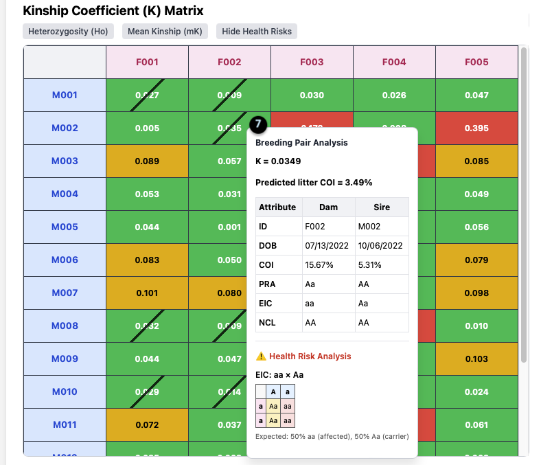
Health Risk Analysis
7. Health Risk Analysis Tooltip: When you click the `Health Risks` toggle, the tooltip expands to include this section if a risk is present.
In this example (**F002 x M002**):
- The pairing has a Kinship of `K = 0.0349`, but the tool has identified a health risk.
- The specific risk is `EIC: aa x Aa`.
- It provides a Punnett square and the expected outcome: “50% aa (affected), 50% Aa (carrier)”.
- The diagonal slash on the matrix cell also visually flags this risk.
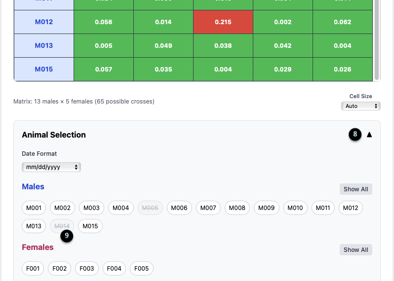
Animal Selection Panel
8. Panel Toggle: The up/down arrow collapses or expands the Animal Selection panel.
9. Animal Chips: This area lists all males and females in your population. Clicking on a chip (e.g., `M005` or `M014`, which are greyed out) temporarily removes that animal from the matrix, allowing you to focus your analysis. The matrix dimensions update to reflect the change (e.g., “13 males x 5 females”).
Heterozygosity (Ho) Display
10. Hide/Show Toggle: After clicking the `Heterozygosity (Ho)` toggle, its label changes to `Hide Heterozygosity (Ho)`.
11. Ho Data Column/Row: This adds a new column for females and a row for males, displaying their individual `Ho` value (e.g., F001’s Ho is 0.380).
What it means: Ho is a measure of a dog’s internal genetic diversity. Clicking the arrow next to `Ho` allows you to sort the animals by this value, helping you quickly identify which dogs might bring more genetic variation to a litter.
Genotype Matrix View
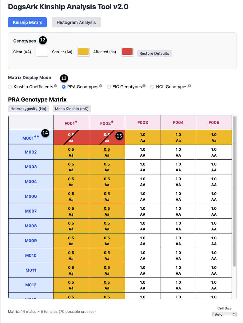
12. Genotype Legend: This shows the color key for the genotypes: `Clear (AA)` is white, `Carrier (Aa)` is yellow, and `Affected (aa)` is red.
13. Display Mode Selection: This shows that the `PRA Genotypes` mode is currently active.
14. Affected Animal Notation: The `**` next to an animal’s ID (e.g., `M001**`) indicates that it is affected (aa) for the selected gene.
15. Carrier Animal Notation: The `*` next to an animal’s ID (e.g., `F002*`) indicates that it is a carrier (Aa) for the selected gene.
Histogram: Kinship Distribution
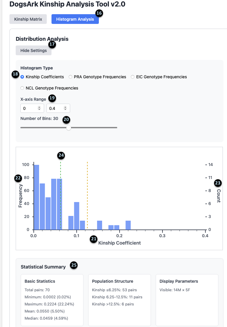
16-20. Histogram Settings: These controls allow you to customize the histogram. You can toggle between `Kinship` and `Genotype` frequencies (18), set the `X-axis Range` (19), and adjust the `Number of Bins` (20).
21-24. The Chart: This graph visually represents the distribution of kinship values for all possible pairs. The X-axis (21) is the Kinship Coefficient, and the Y-axis (22) is the frequency.
25. Statistical Summary: This provides a detailed breakdown of the population’s kinship data.
- Basic Statistics: Shows there are 70 total pairs, with a mean (average) kinship of 5.50%.
- Population Structure: Summarizes how many pairs fall into different kinship categories. For example, 53 pairs have a kinship of 6.25% or less.
- Display Parameters: Confirms the data is for 14 Males and 5 Females.
Histogram: Genotype Frequencies
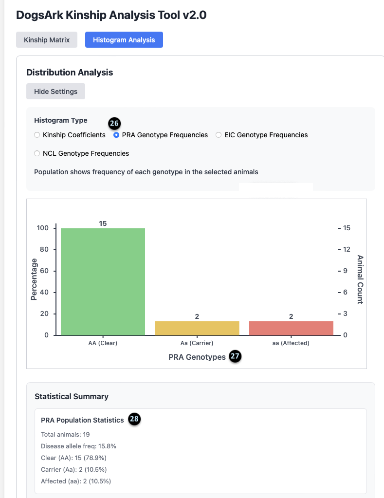
26. Genotype Mode: This confirms the histogram is displaying `PRA Genotype Frequencies`.
27. The Chart: This bar chart shows the total number of animals in each genetic category. For PRA, there are 15 Clear animals, 2 Carrier animals, and 2 Affected animals.
28. PRA Population Statistics: This summary provides key stats for the selected disease.
- There are 19 total animals in this population.
- The `Disease allele freq` is 15.8%, which is a measure of how common the recessive gene is in the group.
- It gives a count and percentage for Clear (15, 78.9%), Carrier (2, 10.5%), and Affected (2, 10.5%) animals.